Frescalo
Frescalo stands for "FREquency SCAling LOcal" (Hill, 2012)1 and was developed by Mark Hill, former head of the Biological Records Centre when it was at Monks Wood. It attempts to adjust ("rescale") the relative frequencies at which species were observed in local area ("neighbourhoods") according to the amount of recording effort that was expended in each neighbourhood. Neighbourhoods are defined as a set of locations that are both physically close and environmentally similar. For a target location, each location in its neighbourhood is assigned a weight calculated using a combination of its proximity and its environmental similarity. The target location has a weight of 1 and each locality in its neighbourhood has a weights which is less than 1 and declines towards zero as the localities get further away and less similar.
In our case, the localities are hectads (10 x 10km squares of the Ordnance Survey National Grid for Great Britain).Neighbourhoods consist of around 50 hectads with the environmental similarity component being calculated by comparing the topography (mean altitude, slope and aspect), weather (various ecologically relevant measures of temperature and rainfall) and land cover (areas of woodland, grassland, etc.) of these hectads.
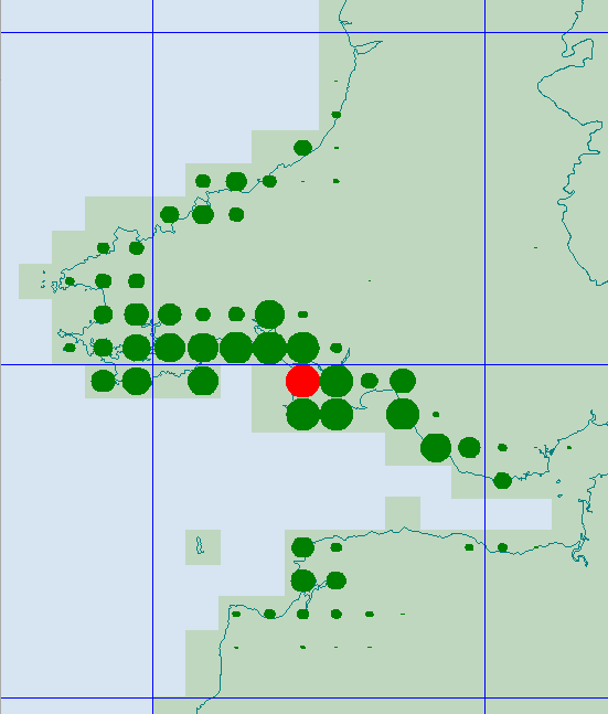
The following map illustrates a neighbourhood. The target square on the coast of South Wales is shown in red. Its approx. 50 neighbouring hectads are shown in green with their weight represented by the area of the circle. As you can see, the neighbouring squares are considered to be mainly coastal and, as they get further inland or further away, their weights decline. Some relatively nearby coastal squares are not included in the neighbourhood - presumably because the environments they provide are rather different.
The basic input data for the analysis is unique combinations of hectad, species and year since 1980 from the Hoverfly Recording Scheme database. It looks like this:
NF75,Episyrphus balteatus,2007
NF75,Eristalis intricarius,2016
NF75,Eristalis pertinax,2016
NF75,Eristalis pertinax,2017
NF76,Anasimyia lineata,1989
NF76,Episyrphus balteatus,1989
NF76,Eristalis intricarius,1989
NF76,Eristalis intricarius,1997
NF76,Eristalis intricarius,2014
For each hectad, records that fall within its neighbourhood are accumulated with the contribution of that record being the weight assigned to its hectad. What we end up with is a weighted sum of the number of records of each species which can be turned into a weighted frequency by dividing by the total sum of weights for all the record from that neighbourhood. If we now rank the species by their weighted frequency, we can plot the weighted frequency against rank and get a form of species discovery curve.
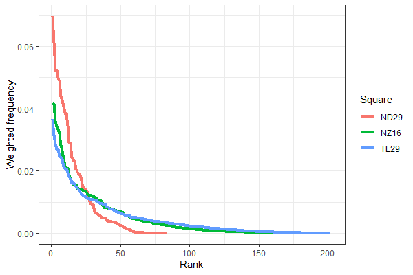
It is clear some localities are better recorded than others. They have received more recording effort and more species have been found. The analysis fits an average species discovery curve across all the available data and then adjust the curve in each neighbourhood towards that average curve shape by rescaling the frequencies of species up or down. There is a basic assumption here that the species discovery curve is consistent across time and space for the particular taxonomic group.
These rescaled frequencies can then be averaged across the hectads to give a measure of the relative frequency of a species in a given year corrected for the recording effort (termed the "TFactor"). This can be plotted against year to investigate how the relative frequency of the species has changed, and hence estimate a trend. It can also be average, for a particular hectad across years and plotted as a map to show how the relative frequency varies spatially.
Calculating a trend
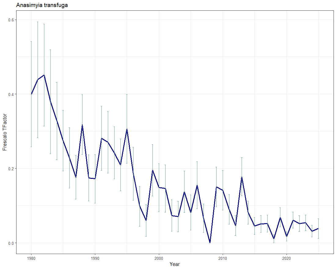
The plot shows TFactor plotted against year. The vertical error bars indicate the standard deviation of those estimates.
To test whether or not a trend is statistically significant, Spearman's rank correlation (rho) was calculated. We have the TFactor values for a series of years from 1980 to present. A conventional correlation (Pearson's product moment correlation) between these values makes certain assumptions - notably that the deviations of points around the estimated trend line are normally distributed. We can't make this assumption here and, indeed, given the way the data is calculated, a normal distribution is unlikely.
Another way of doing this is to rank the TFactors from smallest to largest and also rank the years and correlate these ranks. This is Spearman's rank correlation and makes fewer assumptions. Like the normal correlation coefficient, a positive value of rho indicates an upwards trend and a negative value a downwards trend and statistical tests can be carried out to estimate how likely it is that the particular value is different from zero (p). So, if p<=0.05 and rho is negative we can conclude there is evidence for a significant decline whilst if rho was positive, a significant increase. Otherwise (p>0.05) we conclude there is no evidence of a change.
In this particular example, Anasimyia transfuga, like many specialist wetland species, has shown a sustained downward trend in the frequency with which it has been recorded. Spearman's rank correlation suggests that this is a strong and highly significant downward trend. Hence, this species would be classed as "Decreasing".
Problems
Frescalo assumes that the species discovery curve, the relationship between how frequently species were observed and the amount of recording effort expended in making these observations, is consistent across time and space. If this assumption is not correct then the analysis will be biased. We have reason to believe that the behaviour of recorders has changed over recent years, notably the numbers of records we are getting that are based on people submitting photographs on line.
This sort of recording has increased markedly, especially since the Hoverfly Facebook page was established and in 2018 more than half of the records received by the HRS were from this source. These photographs are heavily dominated by large, obvious and attractive flower visitors. More obscure, small and difficult-to-identify species are poorly represented, especially if they do not tend to visit flowers. This has the effect of increasing the relative frequency of large, obvious flower visitors and decreasing the frequency with which small, cryptic non-flower visitors are observed. This, in turn, will change the form of the species discovery curve and so effect the validity of the analysis.
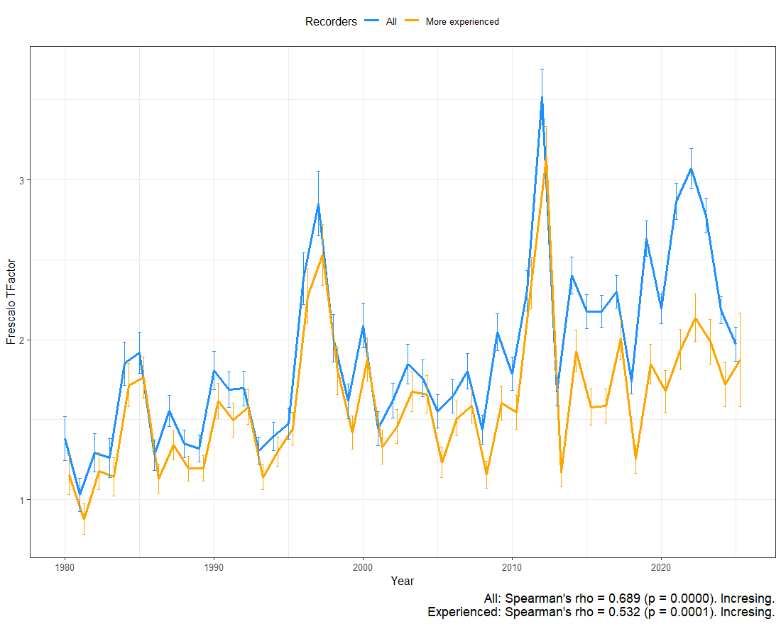
Consider the following two plots in which the trend calculated for all records from 1980-2018 (blue) is compared to a trend based on a dataset of records from more experienced recorders (orange): These were defined as recorders who have submitted records of at least 100 species This has the effect of excluding casual recods and those from recorders who only cover a few of the large and obvious species. These plots compare trends for Eristalis tenax and Platycheirus clypeatus.
Eristalis tenax
Platycheirus clypeatus
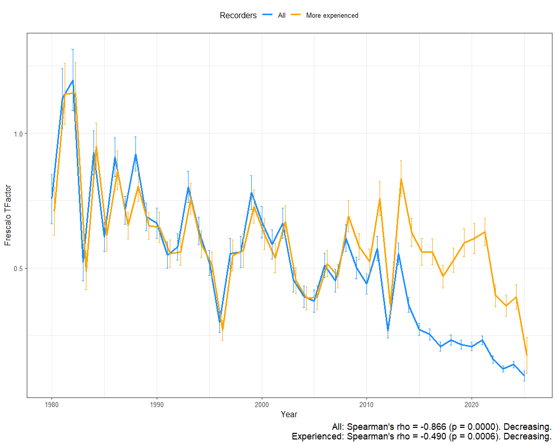
These plots illustrate the effect of the change in recorder behaviour. Eristalis tenax is a large and very abundant flower visitor that often occurs in gardens and urban areas. It is one of the most frequently photographed species. By contrast, although Platycheirus clypeatus is a widespread and frequent species, it is small, mainly black in colour and rarely visits flowers (although is does visit flowers of wind-pollinated plants such as grasses, sedges and plantains to obtain pollen). It is not often photographed.
The increasing impact of casual records of more obvious species over the last decade or so in increasing the relative frequency of the big and obvious flower visitor and decreasing the relative frequency of small and cryptic non-flower visitor are clearly shown. This tends to make it more likely that the photogenic flower visitor will be classed as "Increasing" whilst the small and cryptic species will be classed a "Decreasing".
Bear this in mind when looking at trend plots! We are working with statisticians to try and develop more sophisticated methods which can take these changes in recorder behaviour into account.
-
Hill, M. O. (2012). Local frequency as a key to interpreting species occurrence data when recording effort is not known. Methods in Ecology and Evolution, 3(1), 192–205. ↩